…Iru!

Platforms: PSX
Release Date: 1998-03-26
Regions: Japan
Chris’s Rating: ☆☆☆☆
An extremely dated exercise in unwavering linearity, …Iru! is only interesting when contrasted with better games.

I have a huge collection of obscure horror games that I have amassed over the years. Most of them are Japan-only PS1 releases, and these days they are neigh unplayable. They are so old and clunky that sitting through them is a serious test of my patience. But I keep them around and try to play one through every once in a while because occasionally there is a gem hiding in that geriatric pile. Titles like Hellnight and (I’m told) Overblood 2 are examples of games that still have a lot to teach us about horror design. Every time I buy an old horror game I hold out hope that it’ll be another Clock Tower: The First Fear, an interesting take on the horror genre, something that forces me to adjust my assumptions about what horror games are. A little stroke of genius just waiting to be discovered. Unfortunately, …Iru! is not one of those games.

…Iru! is a first person 3D horror game for the PS1 made by Takara in 1998. The title roughly translates to “…something’s here!,” but the word is so generic that it befuddles most search engines. Iru takes place in a high school that features a large mechanical clock in its center. A number of students who’ve stayed late to finish preparations for a school festival find themselves locked in one night, and soon the bodies start to pile up. The intrepid protagonist, a stoic upperclassman, must figure out what’s going on and try to save his girlfriend from the grips of the nefarious entities vaguely referenced by the game’s title. The game is a first-person exploratory adventure game; you walk around, collect items, and occasionally solve puzzles, but there’s no combat or any other form of action sequence.

That short description probably gives you enough information to guess at Iru’s gameplay. You solve some puzzles, unlock some doors, explore the school, talk to people. Boilerplate stuff, pretty standard for this kind of game. But as routine as this may sound, Iru manages to screw it up in a way that gives me new respect for other adventure games.

Iru’s major flaw is that it refuses to give the player multiple goals. At any given point in the game there is one operation that will advance the story. It might be talking to a person, or visiting a certain location, or using an item. Whatever the action, there’s only ever one correct action at any given time. You cannot get to point C without passing through points A and B, in that order. This makes Iru extraordinarily linear; there’s no way to actually diverge from the main path because the main path is the only path! While other games in this genre tend to implicitly create short- and long-term goals for the player, Iru’s goals are always immediate: find the next story point.

Unfortunately this linear design is somewhat antithetical to an exploration game. What is the point of exploring a space if there is nothing to find? What’s more, the game generally does not give out any clues about where you should go next. You find yourself somewhere in a high school with many rooms, any one of which could contain the next plot point necessary to progress. You could walk aimlessly around for hours and still miss it! That’s not exploration, it’s a waste of time.

Iru is at its worst in the first hour or two. The purpose of this segment is to set the characters and story up, and it involves talking to various students and faculty in sequence. But of course, you can’t know where those people are, so mostly this hour consists of visiting each room over and over again until you find the one that has somebody in it. The game gets a tiny bit better as it goes on because the plot begins to provide more specific goals, but it’s still extremely tedious. In my Silent Hill Downpour review I noted that nobody wants to search for needles in haystacks in video games because it’s just not fun. Iru, unfortunately, is entirely structured around just such an operation.

The real-time 3D engine behind Iru must have looked pretty bad even in 1998, but by today’s standards it is absolutely horrendous. The sound is poor but sometimes unintentionally hilarious, and the controls are bad but serviceable (thank goodness they included a run button). Iru’s story is fairly random and nonsensical, but it doesn’t matter. There are only about ten puzzles in the entire game, but it took me close to eight hours to finish; that should give you some idea of how much time you spend just walking around.

There is one thing I liked about Iru, and that’s its hiding mechanic. Every once in a while (maybe three or four times over the course of the game), an enemy will chase you into a room and you’ll have a limited amount of time to hide before they kill you. You’ll hide in a locker or a cardboard box or something, and then a cutscene will play that shows the enemy walk in, look around, and then leave. Though simple, these sequences are when the game is at its peak. There is a nice graphic at the top of the screen that shows the enemy approaching, and despite the general low quality of the game, the time pressure makes it click (if only for a minute or two). Unfortunately these sequences are scripted and only happen a few times throughout the game.

What is the value of playing old games like Iru? The game itself has almost nothing to teach us; everything it does has since been done more effectively by better, more widely-known games. Nor is this one of those “almost genius” titles that occasionally stuns us with flashes of brilliance. It’s just an old game, weighed down by dated conventions and flat-out bad design. What can we possibly learn from it?

I am a firm believer in the idea that every failure has something to teach us. In this case, Iru’s absolute linearity has made me appreciate the way that Resident Evil, Silent Hill, and every other good horror game ever uses layered goals that operate over different terms. If nothing else Iru has got me thinking about systems in better games that I have thus far taken for granted. It is a sharp contrast from many better games, and that contrast is good meat for study.

Silent Hill Downpour

Platforms: Xbox360, PS3
Release Date: 2012-03-13
Regions: USA Japan Europe
Chris’s Rating: ★☆☆☆
A disappointing entry in the Silent Hill series, Downpour’s flaws stem from a few major design decisions.

Silent Hill Downpour is a disappointing game. It is clearly the worst Silent Hill game to date, and it was justly panned by the press. But what the press can’t agree on is what exactly is wrong with it. Some reviewers like the combat system, others hate it. Some reviewers abhorred the story, others found it interesting. The problems with the game are many, but there’s no consensus on which are the worst.

It’s not that Downpour is half-assed; it is clearly the product of a huge amount of effort. You can tell by looking at it; the art and story and design are deep enough that somebody must have thought about this game pretty hard. The developers clearly know the series; it’s not an exaggeration to describe the game as an amalgamation of previous Silent Hill mechanics and scenes. While there are bugs and other execution problems, it’s not glitches or poor programming that ruins the game. Rather, this is one of those rare games that takes a gamble on a Big Idea, a wholly different approach, and fails miserably. I suspect that the disagreement about which aspects of Downpour are rotten stem from a macro-level design problem, a single decision that caused ripple effects throughout the design of the game. Depending on where you look, you might see a ripple and identify it as a problem. But the real problem is larger, more basic, and its influence is pervasive.

Identifying this underlying flaw can be difficult. It’s hard to separate the symptoms of the disease from the affliction itself. I’d like to work backwards from some mundane execution issues until we discover Silent Hill Downpour’s core problem, the root of all of its other issues. Let us treat the shape of this game is a tree so that we can start at one of the leafs and attempt to make our way back to the trunk.

To that end, let’s start with a rather simple–but frustrating–user interface problem. One of the most annoying things about Silent Hill Downpour is that a “Press A to Pick Up” icon appears every few steps. Murphy, the protagonist, can barely cross the street without being prompted to pick something up. Sometimes he’s discovered an important item, but usually it’s a weapon which will be swapped for Murphy’s current weapon if he decides to collect it. The problem is that the same prompt is used for both items and weapons, which destroys your ability to ransack the area for important items and clues. You can cover a space looking for items, but mostly you’ll only find weapons that you do not want; if you are carrying around a shotgun you’re not about to drop it for a brick. Can you imagine an Adventure-style game that is filled with useless junk which you must sift through to find the one important item? Worse, you can’t actually see what it is that the game wants you to pick up; you must spin the camera up and around until you locate a glowing item on the ground. You do this every few feet. Take a few steps, look at the item pickup. Take a few more steps. Look at the item pickup. It is infuriating.

Let’s move a level up. Why are there crappy weapons strewn all over the ground? The answer is that weapons in Silent Hill Downpour degrade over time and will eventually break. A broken weapon leaves you defenseless, and even if you run away you’ll need to find another weapon before you can progress. But weapons break based on the way the player uses them, and thus the developers can’t control when the weapon will fall apart. Their solution was simply to blanket the game in weapons, thereby solving the problem of becoming defenseless at arbitrary times but simultaneously making it very difficult to find non-weapon items.

Another level up. Why do weapons break in the first place? Is it because they broke in Silent Hill: 0rigins? 0rigins also had weapons that would degrade, and left items around the world as a result. But 0rigins also allowed its protagonist to carry multiple items and swap between them quickly; it even had an indicator of how much more abuse a given weapon could take before breaking. Thus the player can spam the collect button to ransack an area without fear of losing their current weapon. Downpour has none of these things: it limits weapons to one firearm and one other item, there is no durability indicator, and items can’t be stored in the inventory as a backup. If breakable weapons had just been lifted from 0rigins, it seems like they would have gone ahead and lifted the whole 0rigins system. No, items need to break for some other reason.

We’re close to the trunk now. What would happen if weapons didn’t break? Well, you’d find the most powerful weapon (the fire axe, I think), and just carry that around through the whole game, thus rendering the entire weapon system moot. This was never a problem in earlier Silent Hill games because they were basically linear; the developers could easily schedule the release of new weapons to the player (not to mention new enemies) because they controlled the order in which items could be found. This way, previous games in the series used weapon pick-ups as a way to control the level of difficulty (and tension) across the length of the game. Downpour, on the other hand, is based on an open world design, where the player has much more freedom of movement than in previous games, and consequently weapons cannot be easily scheduled.

This is it. This is Downpour’s Big Idea: it is the first Silent Hill game to feature a large, open world for its town. Most other Silent Hill games have featured large outdoor areas, but they’ve never been really open; they’ve always been walled off at the edges so that the player is lead along a very specific path. The open world is a significant deviation from the series norm, and it is the core problem with the game’s design.

We’ve reached the trunk of the design, the root of the game’s decision tree. From here we can see other branches leading to other problems caused by the decision to employ an open world. Let’s follow one down.

I believe that what the developers at Vatra wanted was to make the entire town of Silent Hill a large recursive unlocking space, where the player would criss-cross the map many times, collecting items and solving puzzles on the way, all while progressively widening the available space. Much like the Resident Evil mansion, you might need an item from one side of town to solve a puzzle on the other side of town. Only, the space is much, much larger than the compact Umbrella stronghold. Though you have a map, borders of the space must be traced manually because there are blockades and abysses in the way, not to mention back alleys and side-street shortcuts.

One level down. The size of Silent Hill required the developer to reuse art heavily–it’s just too big to be completely unique. The houses in Downpour’s Silent Hill all look very similar, and some of them even share identical layouts with identical rooms. This isn’t because the developers were lazy (no shipping game was made by lazy developers), but rather the result of a trade-off between the size of the town and the cost of creating high-end art. Consequently Silent Hill is really easy to get lost in; there are not enough identifiable landmarks to get a sense of whether or not you’ve visited this street before (not to mention the ever-present layer of fog that covers the landscape). While each room in Resident Evil’s mansion has a different color scheme, a unique camera perspective, and an identifiable theme, the streets of Downpour’s Silent Hill all look the same.

Another level down. Herein lies a major problem for the designers. If they want the player to criss-cross the landscape, but the landscape is very large and lacks variety, they run the risk of frustrating the player with item quests. Say you need a particular key from one side of town to unlock a particular door on the other side of town. In classic Silent Hill design, this door represents the next step in the story progression–you can’t move forward until you open it. But the key could be anywhere! Do you really want to spend hours running up and down similar-looking streets, trying to find something–anything–that you might have missed before, hoping that it will lead you to the key so that you can progress? No, of course you don’t–nobody does. That sort of item search-a-thon has destroyed games with much smaller problem spaces. In a game like Downpour, where the problem space is huge, it could be deadly.

We’re approaching the end of this branch. The designers of must have struggled with this problem, and the solution they settled on is two-fold. First, they made almost all of the item puzzles optional. If you explore the homes of Silent Hill you will run across puzzles, generally requiring you to go somewhere or collect items, often by backtracking, which you can choose to complete or ignore. Secondly, the designers placed all of the required missions upon a linear path through the town. If you ignore the side missions and just progress towards the next story point you can complete the game without ever backtracking, thus saving you from potential search-a-thon frustration. On paper this seems like a great solution: players do not need to solve every puzzle in order to progress (resolving the key-in-the-haystack problem), and the player himself can regulate how quickly he progresses through the game. People who b-line for the end will have a linear experience similar to classic Silent Hill, while those who embrace the open world are given a bunch of secondary goals for which they must solve interesting traversal challenges. High-five, problem solved!

The leaf problem. In practice the approach does not work as well as I assume the designers had hoped it would. Here the shadow of a single design decision–the idea to make Silent Hill an open world–looms over the entire game, affecting the very core of it in ways that probably were not obvious at the onset of development. The result of the optional side-missions, at least for me, was a complete lack of agency. The game keeps telling us that Murphy is just trying to get out of Silent Hill, trying to escape as quickly as possible. But then it expects us to, in the middle of our flight from danger and his past, drop everything and search the town for some paintings? He should put his escape on hiatus while he scatters the ashes of some stranger somewhere in order to get an item that he already has? Downpour also shies away from setting explicit destinations, so a lot of the time in Silent Hill is spent running around aimlessly, taking turns at random, hoping that something new to do will show up. And if we solve the puzzles, then what? There doesn’t seem to be any gameplay benefit to the side-quests; any weapons handed out will break eventually anyway, and other than an achievement and possibly a story anecdote, there’s no reward offered for traversing Silent Hill more than once. Even worse, at the end of the game the character is pulled out of the town abruptly and never has a chance to go back and complete missions that are half-solved. I ended the game with an inventory full of worthless items that I spent a lot of time discovering but never actually put to any use.

The idea that Silent Hill itself should be an open, explorable world must have sounded good at first. It must have seemed like a great way to differentiate the game from the rest of the series without straying too far from the core elements of Silent Hill. It is a lofty goal, a genuine Big Idea. But I think it hurts the game deeply, and that its aftershocks retard almost every other major system in the game. It is the trunk of the game, but its core is diseased and the sickness reaches all the way out to the leafs of the design. The open world is, in my mind, Silent Hill Downpour’s most significant design failure.

But the open world is just a gameplay system, and Silent Hill games are more than just systems. The series was not made famous by its level design or combat system or inventory screen. It was made famous by its narrative, its characters, and its emotional affect. It’s the content of Silent Hill games, rather than the core mechanics, that keep the audience interested. Though we may spend most of our time climbing the tree, our real goal is to reach a vantage point from which we can observe the surrounding landscape.

We can, if we choose, write off all of the mechanical problems discussed so far as unhappy side-effects of the open world design. Sure, there are annoying flaws and bugs to be found in the nuts and bolts of the game, but it is not unplayable. Perhaps this is one of those diamond-in-the-rough games, and if we look passed its dreary gameplay we might find a compelling narrative lurking. Let us, then, turn our attention to the surrounding landscape.

The ground is dry and spotted with weeds. The key to any successful narrative is pacing. Silent Hill Downpour certainly looks like a Silent Hill game, but it does not feel like one. There is a serious lack of cohesion in the pacing of the game, the structure of the story, and even the characters it involves. There are visual and narrative motifs that are painstakingly introduced and then apparently forgotten. Questions are raised and then discarded. Game mechanics are introduced, taught to the player, and then never once used again. The nozzle controlling the flow of the story only seems to have two settings: information overload or deathly silence.

Bits of trash are scattered everywhere. Here’s an example. The first two or three hours of Silent Hill Downpour play completely differently than the rest of the game. There are mechanics introduced (such as a yes/no question system with character morality implications) that are never revisited. The game spends quite a bit of time introducing crows as a foreshadowing motif, only to then forget them completely. There’s an otherworld transition involving fire that is replicated once more and then never used again. A ledge-grab sequence in the second hour is not used again until the very end of the game. Murphy spends some significant time in a cave with his lighter (rarely used thereafter) reading about its history (which has no subsequent bearing on anything), and fighting a monster type that we never really encounter again. The game teaches you how to throw weapons, a move deemed so valuable that the right trigger is dedicated to it, and this is a move you will perform once for the tutorial and then never again for the length of the game (except by accident, when you discard your weapon in the heat of battle and die as a result).

Downpour does this over and over again, although the worst offenses occur in the opening scenes. It’s as if these first segments were developed independently of the rest of the game–not only does it not feel like a Silent Hill game, it doesn’t feel like the rest of Silent Hill Downpour.

The road runs right off a cliff. Downpour’s most damning failure, I think, is the pacing. Since its inception the Silent Hill series has operated on a consistent rhythm. There’s a descent into the fog world, followed by some time in an indoor section that builds tension up to a breaking point. Just as the tempo reaches its crescendo the fog world is replaced by the otherworld and the level of tension is suddenly doubled. Rather than rising and falling, Silent Hill’s otherworld transition cranks the tempo up to maximum and then holds it there. The player is put under sustained stress as he traverses the otherworld until finally he is released back into the fog world, more dangerous now than before but a welcome respite from the oppression of the otherworld. Recent Silent Hill games have tweaked the formula slightly, but they have all maintained a rhythm to the progression. Beats in the narrative are followed by beats in the gameplay. The pattern of gradual increase of stress, followed by a long, constant stress, followed by release and relief has been used in every Silent Hill game to date.

A thick haze blankets the landscape. For all the bits of pervious Silent Hill games Downpour attempts to copy, it completely fails to reproduce the rhythm that makes the series feel familiar. Part of the problem is the open world, as the duration spent in that area can’t be easily controlled by the developers and thus it’s never clear exactly when the next story point is coming. Downpour does periodically route the player into an extended indoor area (a library, a church, etc), and these areas are where the game is the strongest. And the game has a few startling otherworld transitions as well (such as the Hansel and Gretel sequence). But for the most part, the otherworld transitions happen at random times, often in the middle of mundane, tension-free play. The first transition in the game happens much earlier than any other Silent Hill game to date, at least as best as I can recall: we’re thrown into the otherworld in the first 30 minutes, long before the game has had a chance to really get its hooks in us and ratchet up the tension. Then the otherworld vanishes for several hours, only to return after a tension-free cutscene. The timing is completely inconsistent; there are no discernible beats in the narrative and the transition points feel arbitrary.

The otherworld often involves a running sequence inspired by Shattered Memories (with shades of the red fog section of Silent Hill 3) and is initially a high-tension experience. But as with Shattered Memories, these sections lose their power when they become more difficult. Running through a maze is not very fun, and if you die and restart it is much less fun (and much less tension-inducing) the second (or third, or fifteenth) time around. After restarting a few times you’re thinking about the set of commands you’ll need to input to progress rather than the symbolic implications of the corridors Murphy passes through. Occasionally the game will drop Murphy off in a non-chase otherworld area, but these are not very effective either; the oppressive feel of every other Silent Hill otherworld is completely missing from Downpour’s.

The weak otherworld, made even more impotent by the lack of build-up before its introduction, makes Downpour feel like a random jumble of scenes connected by long, monotonous open world sequences. The tight tension spring, so deftly coiled and released in previous games, is absent. It sometimes feels more like a slinky.

We climbed Silent Hill Downpour’s gnarled gameplay tree and are rewarded with a desolate scene; an inconsistent and untidy, even spatially suspect landscape. The angles do not align, the ground has giant fissures running through it. Neither the climb nor the view are rewarding; there is no glory in the challenge and no value in the prize. The careful gardening that made the early Silent Hill games so wonderful is nowhere to be found here. It’s like an alternate dimension Silent Hill game where things are really bad and nothing makes sense. Quite like a scene from Silent Hill itself, I guess.

Amy

Platforms: Xbox360, PS3
Release Date: 2012-01-11
Regions: USA Europe
Chris’s Rating: ☆☆☆☆
An interesting idea is completely ruined by mechanical flaws and lackluster design.

Amy is one of those games that sounds great on paper. Designed by Paul Cuisset, a veteran game developer famous for creating the seminal Flashback (one of my favorites), Amy is a horror game in which you must lead a small autistic child of the same name through a zombie-infested town to reach a hospital where she can hopefully receive treatment. The whole town is infected with the zombie virus but Amy is immune, which means that the protagonist, Lana, will remain human as long as she stays close to Amy. If they are separated the virus starts to set in quickly and within a minute or two Lana will herself become a zombie. There’s a little stealth along the way, puzzles involving pair play with Amy and Lana, and not a single gun to be found. It sounds like a pretty neat premise; it sounds a bit like Siren (another favorite). On paper it’s a design that should provide a large problem space to explore, and one that should service the game’s horrific theme.

But of course it doesn’t work. Amy is god-awful.

I knew this going in. Jim Sterling at Destructoid, a die-hard horror fan if there ever was one, called Amy “one of the worst games of all time.” Several friends who play games for a living warned me that Amy was horrible, possibly even uncompletable. But often I have found that even the most terrible games have a little spark of brilliance lurking in them somewhere–a faint glow that, while insufficient to save the game, is worth discovering.

Now that I’ve completed the game I can say with conviction that Amy has no such spark. It’s not just that the level design is terrible (it is), the puzzles are contrived (they are), or that the stealth design is horrendous (it is); Amy is a fundamentally broken game. Almost every mechanic in the game is buggy or flawed in some way. Collision detection, path finding, combat, puzzle progression–you name it, it’s broken. Take combat for example: when Lana is hit by an enemy she stumbles back away from the direction she is facing, which sounds ok until you realize that this will cause her to actually walk into her attacker when she is hit from behind. You can spend your time collecting items but your inventory (including your weapon) is emptied at the end of each chapter anyway so it’s quite pointless. Or consider the controls: the camera is pulled in so tight that Lana has to walk in wide circles to go anywhere. Of course, collision detection doesn’t work either; you can hit electrified fences and the like without actually getting anywhere near them. It’s impossible to appreciate the design because you can barely play the game.

That said, I think that even if Amy was free of mechanical issues it would still be a poor game. The mechanics of holding hands with the child to heal, allowing yourself to become infected in order to sneak passed zombies, and forcing the player to leave Amy alone in order to solve puzzles all seem to have depth, but almost none of that depth is explored in the game. Almost every puzzle in the game is a version of a simple problem in which you must get Lana and Amy into appropriate locations so that one can raise or lower an elevator while the other boards it. These puzzles are predicated on the supposition that in the future mankind will have deemed it fit to remove elevator call buttons from their normal location inside the carriage and instead place them across the room or in other rooms altogether. Even excusing the contrived setup, these puzzles are just too simple to sustain an entire game, even a short one like Amy.

It’s worth noting that the developer, VectorCell, released a patch for Amy after it was released. The patch apparently adds more checkpoints and auto-saves between chapters. Many of the reviews that came out when Amy was released complained that the game could not be completed because the checkpoints were way too few and far between, and this problem seems to have been significantly mitigated by the patch. This doesn’t actually make Amy any better of a game, mind you–it just means that it’s now possible to complete.

There’s really not much positive to say about Amy. It is severely broken, and even if it was not so damaged, it seems incapable of flexing its design muscles. A potentially interesting design is utterly wasted on this game. It seems likely that the developers were forced to ship this game long before it was ready–the unused powerup slots and inventory space in the user interface indicate that there might have been more game here once upon a time. Almost every game I complete has something worth exploring, some little interesting spark to suss out and examine. Amy, on the other hand, is one of those titles that has absolutely nothing going for it.

Ikenie No Yoru

Also known as: Night of Sacrifice
Platforms: Wii
Release Date: 2011-03-24
Regions: Japan
Chris’s Rating: ★★★☆
Incredibly simple gameplay is made scary by the use of the Wii Balance Board for movement.

Ikenie No Yoru (???????, “Night of Sacrifice”) is the only game I know of that uses the Wii Balance Board other than Nintendo’s own Wii Fit. It’s a horror game set in rural Japan, a desolate spot called Tsukuyomi Ravine, and stars five high school students identified by colors. Blue is the protagonist, Yellow is the heroine, Pink is the popular girl and Red is her boyfriend. They are visiting a home owned by Black’s father, who vanished without a trace some years ago. You can leave the characters with color-based names if you want, but the game encourages you to name them after your real life friends.

The game mechanics are extremely simple. Walking in place on the Balance Board causes the first-person viewpoint to walk forward in the game. You set the pace with your feet, and often you will find it necessary to literally run for your life. The Wiimote acts as a flashlight and allows you to steer your character through the house, the surrounding buildings, and of course, various basements and caves and other foreboding places. These areas are inhabited by ghosts who will kill you in a single hit if you get too close (the game helpfully records the exact time and date you were ‘cursed’), but they can generally be avoided by high-tailing it or occasionally sneaking around. There are doors to open and a few notes to find lying around, but there is no inventory, no items to collect, no health and no life bar and no weapons. The levels are pretty much linear–all you can do is traverse from point A to point B, avoiding ghosts along the way. This is first person exploration in one of its simplest forms.

From a design perspective, Ikenie No Yoru is barely even a game. There have been simple, non-combat first person horror games before (think Hell Night and Echo Night: Beyond), but those games involve more traditional item puzzles, or at least labyrinthine level design. Ikenie No Yoru does feature a few different forms of challenge (sneaking, running away, hiding, searching, balancing on the Board), but all of them are based on the two extremely basic inputs: moving forward by walking and navigating with the Wiimote. Heck, the only button used in the game is A, and only then to open doors. The enemies are generally brainless, and though they will sometimes chase you, they mostly just stand around. The only puzzles in the game involve figuring out how to navigate through gauntlets of enemies without getting grabbed and cursed, and generally these are very easy. In fact, the game designers have gone out of their way to make sure the game is easy: some levels even have signs that say things like, “anybody being chased by a ghost should hide out here.”

Sounds pretty unsophisticated, right? The graphics are passible, but this is a Wii game and they are nothing special. The art style makes some interesting choices related to character design, but mostly you are walking around through very dark, oppressive places. Basements and caves and tunnels and things like that; if you have ever played a horror game before it is all familiar territory. The enemies are the same sort of pale-person-with-no-eyes type that plague a lot of other recent Japanese games, and there are only three or four variations total. The music and sound are quite nice, and in some places done particularly well, but for the most part the sound is understated and subtle. There’s a story, and it’s presented in an interesting way, but it has no real bearing on the game play.

Ikenie No Yoru is a horror game with literally nothing extra. It’s only real stand-out trait is that it uses the Wii Balance Board for movement. It is about as basic as you can make it.

And yet, the crazy thing is, it totally works.

Ikenie No Yoru is way scarier than it has any right to be. There’s nothing about the game itself that is particularly convincing, and as a grizzled horror game veteran I pride myself in waltzing through these games as an analyst rather than a participant, but Ikenie No Yoru got the drop on me more times than I’d like to admit. The game play is trivial, the graphics are inconsequential, and the story is mostly revealed outside of the game itself. But despite its absolutely basic interface and ho-hum content, Ikenie No Yoru is a scary game.

The key to Ikenie No Yoru’s success is the Wii Balance Board. The first-person interface, combined with actually stepping on the Board to make your character take a step in the game, makes the content totally work. Similar games with similar interfaces (like Calling and Ju-on: The Grudge) are not as effective because they do not use the Board. Even so, it wasn’t clear to me what it was about the Balance Board that made it effective. Why does Ikenie No Yoru’s content work when similar games come off as simplistic and arduous?

First, the level design and game content, while simple, is well-made. There are no mundane problems with collision detection or controls, and the levels remain diverse and compelling even though they are incredibly linear. The character animation is pretty good and the story is interesting. Though there’s not much to it, what’s there is good. Most importantly, there’s nothing to pull you out of the experience.

Before playing Ikenie No Yoru I wondered if the Two-Factor Theory of Emotion would make a game designed to raise your heart rate with exercise extra scary. Now that I’ve completed the game it seems like a solid explanation. The required physical motion is pretty light, but it did cause my heart rate to go up. I walked a total of about 15000 steps for this game, and toward the end I could feel each running escape in my calves. There is definitely enough work going on to increase my physiological state, but not so much that I was aware of it while playing. After each session, however, I noticed that I had started to sweat, and my legs had that pleasant burning associated with a good walk. During play my focus was squarely on the game. The two factors of the theory are elevation of physical state without an obvious cause and a contextual cue from the outside environment that the mind uses to make up a label for the elevated state. Ikenie No Yoru seems to meet those requirements perfectly: walking on the Balance Board is enough to cause your heart rate to rise and your breathing to increase, but not so much that you are conscious of it. At the same time, the game is streaming its horror content in first person, sans any sort of HUD or other on-screen display, directly into your brain through your eyes and ears. If we believe that Two-Factor works, the theory tells us that our brain may react to these inputs by mistaking our elevated physical state for fear and synthesizing an emotional response. The result, at least for me, was a fun and sometimes genuinely stressful experience.

As an aside, Ikenie No Yoru also has a funny bonus mode that you can unlock after beating the game on Hard Mode. The funny mode, called Heart Mode, uses the game content and characters to create a short faux-erotic game (“eroge,” as the Japanese say). It’s just a joke: there’s no actual nudity or erotic content of any sort, just the characters saying the same vapid things that eroge characters say (“I’m going to need to to check my entire body for signs of the curse!”), and I’m sure the developer didn’t intend for anybody to actually take it seriously. Still, I have to wonder: there is evidence that the brain hack described by the Two-Factor Theory can be used to falsify arousal the same way it can falsify fear. Is Heart Mode more effective as erotic content than it was intended to be because it requires the player to walk in place a bit as he plays? I didn’t actually unlock the mode, but it’s an interesting thought.

Though the content of Ikenie No Yoru is pretty thin, there are some areas where the developers betray their hardcore influences. The game is broken up into missions, short episodes that are organized around several playable characters. There’s also a section of missions called “Afterward” that take place after the main events of the game and star anonymous characters. The missions unlock such that you play a few missions with a character, then go play some Afterward missions, then go back and play more with another character. It’s not as complex or interesting as the crazy characters-over-time spreadsheet in Siren, but it serves a similar purpose: it delivers bits of story, out of order, across multiple characters, such that that the significance of certain events is not clear until the game is complete. There’s some Silent Hill film grain going on, and the characters look like something out of Kamaitachi No Yoru, solid-color silhouettes (presumably to make it easy to mentally replace them with the real life friends after which they are named). In addition to the simple narrative the game is occasionally interrupted by cell phone messages (from unknown senders, of the “diediediediedie” variety), which is a nice touch as well. Though Ikenie no Yoru is clearly designed to be a casual game, its developers are clearly familiar with the hardcore stuff.

Ikenie No Yoru is a very short, very easy game. It has few flaws, mostly because there’s not enough there to actually be flawed. Despite its casual approach and extreme simplicity, it works very well as a horror game because it uses the Wii Balance Board as a primary input. It is a fascinating example of the Two-Factor Theory of Emotion in action, and, occasionally, surprisingly scary. It’s worth a look as an outlier in this genre that works.

Dead Space 2

Platforms: Xbox360, PS3
Release Date: 2011-01-25
Regions: USA Europe
Chris’s Rating: ★★★☆
Slick as ever, Dead Space 2 is way more interesting than its predecessor.

I had problems with the original Dead Space. It played well enough and was clearly a high-end, well-produced game, but it just didn’t do anything for me. There was nothing to keep me interested, and for a guy who has a whole site dedicated to horror games, that’s saying something. In my review of Dead Space, I concluded that the major problem with the game was that it was simply too straightforward; it almost never required me to think very hard about what I was doing.

I am quite happy to report that Dead Space 2 is a significant improvement over its predecessor. The game remains an incredibly polished high-end game, but certain changes to the formula allow it to be much more successful, both as a fun action game and as a scary horror game. Rather than just enumerate all of the improvements Dead Space 2 makes over the original, I’m just going to focus on the areas that I think afford horror in the game.

By far, the most dramatic improvement is in the design of the levels, both in terms of the layout of the space and the way the levels are visually represented. Dead Space 1 had pretty much one level theme: “inside a space ship.” Dead Space 2 provides a significantly more diverse environment. The key is that Isaac is no longer on a space ship: he’s now wandering around a giant space colony. There are malls, stores, and government high-rises. The setting allows the narrative to explore environments that are common to horror games, including a church, its morgue, and even a school. Though Dead Space 2 also has its share of maintenance shafts and studded metal hatches, on the whole the levels are much more diverse and interesting. Each area looks visually different and the overall color palette changes from area to area as you progress, making it much more visually appealing. It’s still a pretty linear affair, but now there’s a lot of reason to progress: it’s fun to see what’s coming next.

The second key to making Dead Space 2 a better horror game is the focus on characters. Isaac in particular has a lot of dialog this time around, and he’s constantly taking his helmet off, which reminds us that he’s still just a fragile human under that badass armor. There is a fairly poor plot twist early in the game, but after that the characters are interesting and believable. Isaac is still a pretty stoic dude, but his character is improved by the constant appearance of his dead fiancée. Her apparition is scary in and of itself (and she looks phenomenal, with light pouring out of her eyes and mouth), but her real benefit is that she gives Isaac a chance to reflect, show some weakness, and maybe wonder whether or not he’s gone completely crazy. The voice acting helps sell the characters as well; at one particularly great point we hear Isaac’s voice start to falter, and we know that he’s really nervous about the area he’s about to enter. Because he’s been established as a real character, the effect works: we get pretty nervous too.

The rest of the game is pretty similar to its predecessor, but everything has been streamlined. Gone are the terrible mini games, but the interesting power node system returns. Most of the puzzles still involve shooting, time slowdown, or telekinesis, but they are better constructed and more fun than before. Zero G movement is vastly improved, and the level segments without gravity is where some of the most interesting exploration problems take place. And, when Dead Space 2 decides to be a big, bombastic action game, it pulls it off really well and doesn’t overdo it. Some of the problems from the original return (the invincible enemy still isn’t any fun), but for the most part Dead Space 2 is better in every category.

It would be remiss of me not to mention how fun the gameplay is. Even absent the horror content, Dead Space 2 is a really awesome shooter. There are certain weapons that seemed weak initially but with practice became insanely powerful. The weapon variety is also nice; once I found four guns that I was happy with I didn’t even bother buying any others because I was very satisfied. As I mentioned above, the levels and puzzles are also improved, so even if this game wasn’t about scary stuff I think it would be quite enjoyable. I got pretty hooked and finished all 13-odd hours in three or four lengthy gaming sessions. Importantly, the design has come into its own; it has progressed beyond “Resident Evil 4 in space,” which seemed to be the guiding idea behind the first game.

All that said, I think that Dead Space 2 still sells itself a little short. All the parts are there, and this time around they work together very well, but the game never reaches that transcendental state where the mechanics fall away and you are absolutely immersed in the game. Dead Space 2 is still too straightforward to be an excellent horror game; while it’s much more interesting than the original Dead Space, it still doesn’t give us enough cognitive meat to chew on.

To understand where Dead Space 2 goes astray, we need to be familiar with the concept of negative space. Negative space is all the things that the game doesn’t tell you; the areas that it suggests exist but never renders clearly. It is where all of the paths that are blocked off lead; it is what’s behind the locked door you can never open. It’s the parts of the story that are suggested but never addressed, or the answer to riddles posed by conflicting evidence. It is the area where your imagination is free to roam, where no solutions have been authored in advance. It is up to you to fill in the blanks, draw connections, and come to your own conclusions.

Negative space is a fundamental part of almost all forms of successful horror media because it allows the author to create fear that is tailored just for you. Or rather, the author lets you create your own fear; negative space allows you to come up with a personal explanation for things, and that’s almost always scarier than anything a game or film can show you on the screen. Is Silent Hill a more interesting place when we believe that it’s the creation of a crazy cult that’s into organized crime? No! It’s a much scarier place where there is no explanation, when the logic that guides it is apparent but fuzzy, when you yourself have to guess at what is going on.

Dead Space 2, like its predecessor, doesn’t build enough negative space for the player’s imagination to explore. Not that it doesn’t try–there are details and hints dropped occasionally that contribute to a small amount of mystery, but for the most part the events that occur in the game are pretty cut and dry. The linearity of the levels contributes to this; there’s only ever one correct way to go, and you have a little tool that will draw a line in that direction if you get confused (though, to be fair, the end of the game handles this very well). The dialog and logs left by former crew provide a few juicy morsels, but most of them are concerned with the next short-term goal rather than expanding the depth of the universe within which the game operates.

For example, early in the game we learn about “planet cracking,” a futuristic slash-and-burn practice that extracts resources while destroying the source, but this idea is not revisited over the course of the game. It’s mentioned in passing at the very, very end, and by then the effort is wasted; you could remove those details from the game an not affect the experience one bit. The few bits of narrative mystery that are there seem to be concerned with setting up a plot for some future game rather than expanding the imagination space. The biggest potential mystery of the game, namely “where did all these monsters come from,” is answered pretty concretely early on and then never revised. The eye machine, which is referenced obliquely over and over again in dialog, eventually comes and goes without the revelation of any new clues or any obvious change in the game. Dead Space 2 has many opportunities to expand the area of negative space it provides, but in most cases it passes them up to its own detriment.

In addition to a negative space that it two sizes too small, I also think that Dead Space 2 respects the player too much. I’ve mentioned how “respectful” design can hurt horror games before. The idea is that the game shouldn’t change the rules on the player mid-way through the game. In fact, it should take steps to enable its content to be more accessible to a wide range of players, like automatically adjusting difficulty or making it very obvious what the rules of the game are. This approach is correct for most types of games, but it can be antithetical to horror. The horror game requires that the player be kept on their toes; they need to feel as if they are not in control of the situation in order for it to remain scary over the length of the game. Not knowing what the rules are, or believing that the rules can change at any time, is an extremely effective way to keep the player from becoming comfortable and treating the game as a purely mechanical problem.

Dead Space 2 would be a better horror game if it respected the player just a little bit less. For example, Isaac often has to climb into maintenance shafts in order to get around locked or blocked doors. These shafts are like tiny air ducts; the space is claustrophobic, the camera closes in to show only Isaac’s immediate area, and often he travels through walls with some pretty scary-sounding stuff happening on just the other side. These areas are intended to be scary, but ultimately I found them relaxing. I can be quite certain that nothing will ever attack me in a air duct because there is no way to defend myself. The game respects the player too much to allow for a cheap, un-blockable hit, and so these areas are guaranteed to be safe. If the game had hit me once or twice over the course of the game in an air duct, each passage would have been much scarier. I wouldn’t have been able to relax in the knowledge that I can predict the game’s behavior. The maintenance shafts would have become areas where I had no weapons, rather than areas were I am in no danger. To some degree, the slickness of Dead Space 2’s game design also prevents some avenues for horror; it just can’t bring itself to change the rules on the player often enough to keep me unbalanced.

Dead Space 2 is engaging, the production values are through the roof, and it’s very fun. It does a pretty decent job of mixing action and horror, and though I think it misses a few opportunities to expand its horror repertoire, there’s no denying that it’s extremely well made. The improvements over the original Dead Space are simple but effective, and the result is a much stronger game. No longer content as a Resident Evil 4 clone in space, Dead Space 2 has come into its own. It’s a really fun, and occasionally quite scary game.

Catherine

Platforms: Xbox360, PS3
Release Date: 2011-07-26
Regions: USA Japan
Chris’s Rating: ★★★★
A thriller with sex, curses, and… block puzzles? Catherine is one of the most innovative and difficult-to-catagorize games ever.

Though this site has cataloged many horror games, most fall into one of a few distinct categories. You’ve got your exploration / puzzle games (in first or third person), your action games, a couple of stealth games and the occasional brawler. Throw in an adventure game or two and you can account for almost every horror game ever made.

Except for Catherine. Catherine defies categorization; it is unlike any game I’ve played before, horror or otherwise, in both theme and play style. It’s certainly a horror game, but the brand of horror it has to offer is a unique blend of fear-that-my-secret-will-be-revealed and insane, ego-crushing difficulty. It’s an adventure game with no exploration, a puzzle game with a significant story. It plays with sex, relationships, the emotional significance of marriage and adultery, and will even teach you a fair bit about various alcoholic drinks. Catherine is a weird, difficult, fascinating, and stressful game; I don’t think there’s ever been a title quite like it to date.

Vincent is a 30 year old programmer who spends most nights drinking with his friends at the Stray Sheep bar. He’s been going out with Katherine for five years, and lately she’s been hinting (read: threatening) that the next step in their relationship is marriage. Vincent isn’t ready for such a big commitment; “What’s wrong with our relationship the way it is?” he asks. He loves Katherine, or at least he says he does, but he can’t bring himself to actually consider the possibility of marriage. For the moment, his approach to the problem seems to be to drink it away.

His situation takes a dramatic turn for the worse when, after getting particularly hammered one night, Vincent wakes to find a strange girl naked in his bed beside him. His memory from the night before is hazy, but he gathers that he met the new girl, named Catherine, at the bar and eventually took her home. Catherine is the polar opposite of Katherine; she is young, athletic, blonde, fun-loving, and quite cute. Despite her good looks and apparently intense interest in Vincent, her presence is terrifying: Vincent realizes he’s cheated on Katherine, and if she finds out it will be the end of their relationship. Catherine, for her part, lets him know that if she ever found out that he was seeing other girls, she’d kill him (and the way she says it, sitting on his chest and tracing a line down his bare sternum, he’s not quite sure if she’s joking).

Vincent tries and fails to break his new relationship off. In the mean time, his primary goal is to ensure that Katherine and Catherine never find out about each other. The news is full of stories of men found dead in their beds, and the rumor mill suggests that these men were cursed by women they had wronged. At the same time, Vincent has a series of nightmares involving sheep, an endless staircase, and Katherine. He can’t quite remember the details in the morning, but he knows something is going on. I mean, above and beyond his problem with his girlfriends.

Catherine has a long and interesting story. The bits I’ve covered here account for the first hour or two of play; things continually worsen for Vincent over the course of the game, but there are some twists and turns along the way that I didn’t expect. The story is told through dialog, mostly in-game with an occasional cut scene, and the writing and voice acting is great (I played the Japanese version). The art and presentation is also top-notch. Catherine sports one of the best toon shaders I’ve every seen; it perfectly captures the manga chic art style upon which the game is based. Oh, and the sound, particularly the music, is similarly high end.

But it’s the story that provides the incentive to keep playing; though the game itself is fun and the production values high, the main reason to complete Catherine is to find out what happens to Vincent. The story is so well told and the characters so interesting that I was willing to work really hard to see the game through to its conclusion.

Now that I’ve spent so much time talking about story, it might surprise you to learn that Catherine is mostly a block puzzle game. Each night Vincent has a nightmare that constitutes the main component of the game: scaling a large tower made of blocks that he can move around to create a path. Blocks can be pushed or pulled, will stick to adjacent blocks and sometimes have odd properties (there are blocks that crumble, blocks that explode, slippery blocks, etc). The bottom of the tower is falling apart–the blocks float in space over a giant abyss–and so Vincent must constantly ascend in order to survive.

The block puzzle parts of the game are hard. I mean, really hard. Atlus released a patch shortly after Catherine went on sale that made it slightly easier (continue items give you two continues instead of one), but even with the patch the game is neigh impossible. You will die in this game, over and over again, on the same level, sometimes for days on end. It was not uncommon for me to die 50 or more times on a single level towards the end of Catherine; we’re talking about sections that take several hours to complete with no save points on the way. The block puzzle mechanics are smart and the puzzles are fun, but goddamn, the game is hard.

The other significant mode in Catherine is the Stray Sheep mode. In this mode the player can control Vincent as he drinks with his friends, checks his e-mail on his phone, and walks around the Stray Sheep bar. This is where much of the story exposition occurs, and it’s the “Adventurey” part of the experience. The best part about Stray Sheep mode is that Vincent can send and receive e-mail from Katherine and Catherine on his phone. The phone writing interface is genius: it lets you compose messages from a collection of options for each line (the options change with every mail), and your goal is to write the message such that Catherine (or, more often, Katherine) doesn’t get angry. This system completely captures the stress of trying to write a carefully-worded but highly political e-mail. It’s one of the best parts of the game because it puts you right in Vincent’s shoes and makes you feel like an accomplice to his adultery. It’s possible to purposefully write these messages like a jerk, and apparently if you act like a jerk throughout the whole game the ending changes. But given the setup I suspect few people will do that; they’ll act the way Vincent wants to act, which is desperately to placate his suspicious girlfriend and simultaneously rid himself of his unintentional lover without provoking an attack.

I have a few issues with the game, almost all of which have to do with the block puzzle mode.

The first problem is a big one: the controls are not tight enough. That’s not to say that the controls are loose; on the contrary, they are wound so tight that you’ll play with the d-pad rather than the analog sticks. But even highly responsive controls are not enough for the level of difficulty Catherine asks of its players. Specifically, the game fails to parse the difference between “turn around” and “turn around and go forward” way, way too often. Many times turning around will result in unintended movement, and in a game where a single misstep can cost you the level, that really sucks. I thought at first that I just wasn’t being precise enough, and that the problem would go away as my muscle memory improved, but this didn’t actually happen: I was unintentionally running all the way up until the very last level.

The game play in the block mode has to do with moving blocks. It must be done very quickly or Vincent will fall to his death. However, a single wrong move generally dooms the player. Part of Catherine’s intense difficulty is that there’s no undo, no way to go back and revert an unintended move. Combine that with not-good-enough controls and you have a recipe for frustration. I cannot count the number of times I accidentally pushed a block when I intended to pull it, or jumped onto spikes when I only intended to face them. It happened to me in every level, in every play session. Games that are this hard can’t have ANY issues with the controls, or the difficulty becomes arbitrary and frustrating.

The other major problem with the block mode is the checkpoint system. Levels have checkpoints, but towards the end of the game there are very few. In the last couple of levels you’ll reach the one and only checkpoint very early in the tower (in the first 5th, usually). Since one wrong move can screw you in this game, the way to progress up the tower is to try something, fail, restart, try something different, succeed, go to the next section, try something, fail, restart, etc. What happens in practice is that you keep doing the same actions over and over and over again, making tiny amounts of incremental progress as you attempt to memorize each section of the tower. You’ll find yourself completing the puzzle areas immediately after the checkpoint again and again–20 tries, 40 tries, 60 tries later. At that point the puzzles hold no value; you know how to complete them and are in no danger of failing, so they become a route chore. The game would have been much better if there were more checkpoints so that you don’t have to repeat the same ten puzzle areas for each and every failure.

Despite a few flaws and the thumb-agony difficulty, Catherine remains an absolutely fascinating game. It’s challenging, both as a game and to you, the player. It asks difficult questions like “what is the value of marriage?” “is it cheating if you were drunk?” and “which is better: a complex long-term relationship or strings-free casual sex?” And when I say asks, it literally asks: at the end of each level Vincent is quizzed on his position on life, relationships, and love. The game then gives you an Everybody Votes-style breakdown of what all the other players said. This is ground not frequently trodden by video games, and almost never at this level of quality. The story is interesting partially because it plays with sexual imagery while simultaneously dealing with these sorts of sticky commitment questions. When Catherine appeared naked in Vincent’s bed my emotional response was increased stress rather than titillation; the game already had me under its control and was able to work its emotional levers as it saw fit (note that Catherine has no real nudity, but it’s a bit racy nonetheless).

The goal of a good horror game is to suck the player in and then apply stress to their psyche. Catherine does this wonderfully, in ways I’ve never seen before. It’s one of the hardest games I’ve ever played, and it’s not without a few flaws, but even so it’s one of the best games I’ve played for the Quest.

Nanashi no Geemu: Me

Also known as: Nanashi no Game: Me
Platforms: DS
Release Date: 2009-10-27
Regions: Japan
Chris’s Rating: ★★☆☆
This sequel maintains its predecessor’s unique approach to horror and fixes some problems, but it is still a little too simple.

Nanashi No Geemu: Me is an evolutionary sequel to the original Nameless Game for DS. Like its predecessor, Me (pronounced “Meh,” meaning “eye”) is about a cursed DS game that kills its players within seven days unless they are able to complete it. The game divides its time between this 2D 8-bit Dragon Quest clone and a first person 3D mode covering both screens (the DS is held sideways like a book). My main complaint with the first game was that the cursed game was used only as a narrative device and had little game play purpose–in fact, the entire game seemed too simple. Me addresses some of those concerns, but it fails to correct a number of the basic control and interface problems that made the first game something of a chore. That said, all the good parts about Nameless Game return in this sequel which still manages to be pretty fun.

The Nameless Game series builds tension through the use of two main conceits: quality sound design and the cursed game itself. The sound and music, especially the in-game music from the cursed game, are phenomenally well done; it’s no exaggeration to say that sound is the primary vector for horror in this game. The cursed game, as well as the ancillary UI screens and associated interface (Nameless Game mimics the main DS dashboard screen), are so meticulously constructed that they ground the entire experience in reality. By presenting a near-flawless recreation of a classic game style, the Nameless Game legitimizes the entire experience and makes it very easy for us to buy into the story and game content.

It’s a good thing, too, because other than the cursed game the rest of the experience is pretty weak. The graphics are good for DS but dated by any other standard, the control system remains terrible, and the story is pretty predictable. Nanashi No Geemu: Me suffers from amateurish mistakes in its first person mode. For example, it’s easy to get hung up on walls and edges that can’t actually be seen from the narrow perspective. There’s one terrible level segment in which you must walk around through a graveyard, avoiding a patrolling ghost who is mostly invisible. To complete this stage you must observe the ghost, wait for an opening in his path, then run to another area of the graveyard and collect an item. The graves are laid out in a random pattern, and it’s almost impossible to tell which areas your character can pass through and which are too thin. If you happen to venture into one of these thin spots, chances are you’ll get stuck and then promptly grabbed by the invisible roaming one-hit-kill ghost. It’s like playing a budget FPS from 1998, except without any guns.

That said, the developers of Me are clearly trying to correct some of the design issues that plagued the first Nameless Game. Though the 3D levels remain linear trips from one point to another with little interactivity along the way, Me introduces some much-needed puzzle mechanics using the cursed game. In order to progress through an area safely you must load up the cursed game to see an 8-bit representation of the room you are standing in. Items and hazards that are invisible to the naked eye can be viewed in the game mode, so once you’ve figured out how to safely progress in the game you can then go back to the real world and follow the same path. Unlike the first Geemu there are now hidden items and unlockable levels of a whole new game (more on that in a moment) to be found in within the cursed game’s levels, which makes them a lot more interesting.

The best addition to the formula is the “eye” which appears in the title. Early in the game the protagonist’s left eye (represented by the left DS screen) becomes “infected” by a particular ghost, which allows him to identify areas where ghosts are present. When entering an area containing a ghost the left DS screen will start to get noisy; the closer the ghost is the more dramatic the distortion becomes. This is basically a visual version of the static-emitting radio from Silent Hill, and works almost as well. Ghosts are still one-hit-kill hazards in Me, and the distorted eye serves as a nice tension-inducing foreshadowing device. There are also some nice puzzles involving objects and other level details that can only be seen by the left eye and not the right–suddenly there is a reason to take time and look around the environments rather than simply running straight through. The addition of the infected eye is by far the best improvement Me makes over its predecessor.

The other major change in Me is the inclusion of a second cursed game. In addition to the cursed RPG is a hellish (but optional) side scroller. To play the cursed side scroller you must collect cartridges in the RPG world, each of which represents a level. The side scroller design is a punishing one in the vein of Jinsei Owata no Daiboken, I Wanna Be the Guy, and Super Meat Boy; it’s the kind of game which invites you to jump onto a platform only to reveal it to be covered with hidden spikes. The side scroller fits with the cursed game theme, and I was excited about it when I started the game. The problem with it is that the scroller controls are not quite competent enough to support the level of difficulty that the developers have targeted. The jump button is unresponsive and the other controls are a little too loose. A game like Super Meat Boy can get away with an insane level of difficulty because its controls are extremely tight; the design is hard but fair. Nanashi No Geemu: Me’s side scroller controls, on the other hand, are not tight enough to make the difficult play fun; far too many times you will die because you pressed the right button at the right time and the game failed to respond. This lack of responsiveness in the controls pretty much destroys the cursed side scroller, stripping it of all fun and rendering it a frustrating chore.

There are a lot of other minor changes to the game that improve the experience. The ghosts are used much more intelligently in Me than its predecessor, and are often tied to puzzles in the cursed game. As in the original Nameless Game, the cursed game starts to exhibit bugs and visual artifacts as the curse takes hold. This theme of degradation is extended to the real world and the mock DS UI screens in Me, giving the impression that the curse is affecting the protagonist at a very personal level, almost like the otherworld in Silent Hill. The story, while still fairly boring, is more complicated and less derivative than the original.

But generally speaking, Nanashi No Geemu: Me is the same game as its predecessor with a couple of simple (but mostly effective) tweaks and additions. They key components that made the first game work, namely the sound and cursed game, continue to be effective. The underdeveloped aspects of the first game’s design remain, by and large, overly simplistic. While the quality of the game has unquestionably improved, the degree of improvement is fairly minor; these are things that should have been done in the original Nameless Game.

So, as before, this is a good game for people interested in horror game design to play. This is a game that absolutely requires headphones, so make sure you have a pair before you start. If you’re just looking for some fun thrills on your DS, Nanashi No Geemu: Me might leave you unsatisfied.

Alan Wake

Platforms: Xbox360, PS3
Release Date: 2010-05-14
Regions: USA Japan Europe
Chris’s Rating: ★★★☆
Great writing saves this psychological action thriller from its slightly-too-simple gameplay.

Alan Wake does not bill itself as a horror game. It’s a “psychological action thriller,” which is a label that very clearly describes what the game is about. There are supernatural elements, sure; the protagonist for which the game is named spends most of his time fighting The Taken, people who have been possessed and entirely consumed by an evil force called The Dark Presence. But it’s really not a horror game, and makes almost no concerted effort to scare. However, pending the creation of Chris’ Psychological Action Thriller Quest, I feel pretty comfortable including Alan Wake here; even if it’s not really a horror game, it’s in the company of friends.

It’s hard to write about Alan Wake without revealing parts of the story, which is very much worth experiencing in its original game form. In the interest of keeping this spoiler free, I’m going to talk about Alan Wake in terms of its successes and failures without a lot of actual examples.

The core game loop in Alan Wake is surprisingly similar to Obscure (though there’s no two-player mode, sigh). The central combat mechanic involves using a flashlight (which can be boosted for a short amount of time) to burn away a nebulous darkness that protects The Taken. Once the darkness is gone, you can take them down with regular pistols. This is very similar to Obscure, though the execution is much better than in Hydravision’s earlier example. A typical moment in Alan Wake will involve Wake running through a dark forest when he is suddenly jumped by a couple of scythe-wielding Taken. Guns are ineffective until the protective darkness has been burned away, so the moment-to-moment play consists of dodging away from attacks, keeping the light on each enemy, and then taking them down when they are vulnerable. There are a few other weapons occasionally at Wake’s disposal, such as flare guns and flashbangs, which are highly effective. But most of the game is just running around in the dark, getting jumped by guys, and shooting them.

And, as far as horror games go, that’s a pretty simple core loop. It’s very common for horror games to select simplified combat mechanics in exchange for improved narrative control, so Alan Wake is hardly alone here, but the effect of its simpleness is amplified because the main focus of the game is, unlike many other horror games, action. If you’ve seen reviews lamenting Wake as “repetitive,” it’s probably because people got tired of shooting guys in a dark forest after a while. I can see where they are coming from.

On the other hand, Alan Wake goes all out in its attempt to increase its interestingness along another axis: narrative. Unlike many of the other games on this site, Wake’s narrative is not one of these combination-of-confusing-details sort of thing; though the story itself is a little convoluted, it plays out in a very straightforward fashion. As I said in the opening, it’s almost impossible to talk about the story in Alan Wake without spoiling something, so I’ll just say that the story in Wake is pretty good. It’s got that Stephen King-esque taint-of-evil-hiding-in-rural-America style down pat, and throws in a fairly interesting twist to the whole thing (which, at the end of the game, left me wondering how it could all work out, like a time travel movie in which a character kills his father). Alan Wake’s narrative unfolds in two different, though not entirely orthogonal, directions: as cut scenes and game events which take place as you play, and as bits of manuscript that Wake finds throughout the levels. The way these two connect is pretty interesting; though lots of horror games have documents and manuscripts to find, none of them work quite in the same way as the ones in Wake.

In addition, the writing and dialog in Alan Wake is really good. In particular, Wake’s agent Barry steals the show. But even Wake himself is pretty interesting, and there are several other complicated (for a video game) characters that make their appearance. The manuscript pages themselves are excerpts from an unfinished novel of Wake’s, and remind me of the novel snippets in Deus Ex, although in this game the content is much more directly related to the events of the game. I think the narrative is easily the strongest part of Alan Wake.

Alan Wake is also one of the most beautiful games I’ve ever seen. The characters are a little weird (damn you, uncanny valley), but the environmental art is absolutely phenomenal. Seriously, I’m not really the type of gamer that cares about graphics, but Alan Wake is a really, really nice looking game.

Where things start to go astray is the level design and combat loop. The combat loop, as I mentioned before, is pretty simple, but its simplicity isn’t a problem in and of itself. Rather, the way that enemies appear is a little problematic. Wake will often be running through a forest when suddenly it gets a little darker, and shadows seem to move quickly across the landscape. This is your cue that enemies are about, and you should expect to be attacked in the next minute or two. Since the game takes place in large, open areas, enemies will often approach Wake from the side or from behind. To deal with this problem, the game has a pretty cool effect where it slows time down, pans the camera out to reveal the approaching enemy, and plays a tension-increasing stinger sound, all at the same time. The result is that you see approaching enemies, even those behind you, in a way that gets your blood pumping.

This works really well at first, but once the enemies have been revealed game waits for a while before using the effect again. During a given fight, enemies tend to come from all directions, so it’s not uncommon to be attacked by guys that are behind you. It really sucks to get hit by somebody you can’t see, and that problem is aggravated by ranged enemies that throw blades at you. Even worse, Wake can take hits while he is already reacting to another hit, meaning that if you have bad luck and are hit by two or three guys at the same time, it’s basically instant death.

The levels are also quite large; the traversable space is sometimes so wide (especially in the forest) that it’s hard to tell which way you should be going. Alan Wake actually provides a really cool HUD to solve this (something I haven’t seen before, a sort of “this general direction” cursor), but during a fight it’s very easy to get disoriented. And since almost every level takes place at night, the darkness of the environment adds to the confusion.

But the large level design actually hurts Alan Wake in another, more important way: it makes exploring for the purposes of item collection a chore. I ranted about this a bit already, but the size of the levels conflicts with Alan Wake’s collection quests. Most importantly, it makes finding the manuscript pages, which is the key element that keeps the game interesting in the face of its somewhat simple game play, pretty unfun. It turns out that most (but not all!) of the pages are placed in places that you’ll naturally run across just by playing, but as a player there’s no way that you can be guaranteed to find every page unless you carefully search each area. I went over each level with a fine tooth comb because I really wanted to read all the manuscripts, and let me tell you, walking around it a super dark forest tracing the edges of the accessible space is not very fun (and, despite my best efforts, I still didn’t find every page). These levels were not made to be ransacked–they were made to be fairly linear passages for the player as he travels from one scene to the next. But because the placement of the manuscript pages (and, to a much lesser extent, the collectable coffee thermoses) is unpredictable, a player must choose to either sweep every level for hidden items or run straight through and live with a lot less story detail. It sucks that those two are in conflict and such a decision is even necessary.

And that’s really the only major misstep that Alan Wake makes. It’s not a complicated game (other than the graphics tech–sheesh), but it also hits the mark most of the time. I felt that confusion about the levels, the placement of collectables, and some of the combat mechanics damaged the game a bit, but on the other hand I enjoyed the interesting story, I liked the presentation format that it used, and I really liked the characters that it stars. There are no problems with controls or anything like that–Alan Wake doesn’t waste any time on pedestrian design flaws, but it does get bogged down with a few meta-flaws.

Still, it’s a very fun game and, despite being steeped in classic American horror, it’s pretty unique in this genre. Though simple, I think it’s the kind of thing that pretty much every horror fan will enjoy.

Deadly Premonition

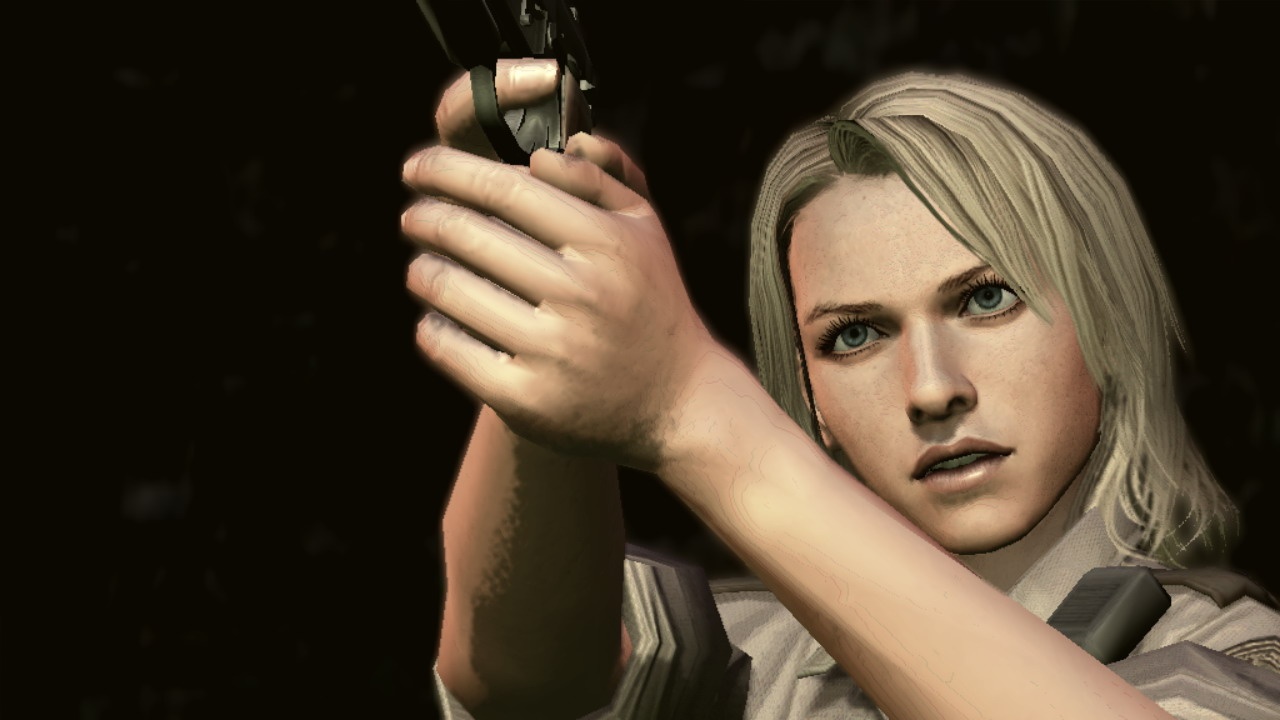
Also known as: Red Seeds Profile
Platforms: Xbox360, PS3
Release Date: 2010-02-23
Regions: USA Japan Europe
Chris’s Rating: ★★★★
This fascinating translation of Twin Peaks to game form isn’t harmed by a few rough edges.

What follows is a long article about Deadly Premonition. I originally posed this as four separate posts on the front page, but here I’ve collected all four posts into a single document. This is tl;dr territory.

This isn’t really a review as much as a stream of consciousness; the game pushes a lot of buttons and rather than trying to enumerate them all, I think I’ll just meditate on the game a bit. That seems like the correct way to approach this particular game.

Before I get started, let me give a short mini-review for folks who don’t care what games mean. Deadly Premonition is Twin Peaks, in game form, as seen through Japanese eyes. Though wacky, it’s fairly low-tech; some of the mechanics are extremely rough, the game play systems feel at least a generation old, and it’s not going to win any awards for prettiness. But what Deadly Premonition lacks in technical polish it more than makes up for in storytelling, characters, and most importantly, its integration of game design and visual presentation. It’s worth playing for any of those pieces, and in combination the game is fascinating. Deadly Premonition is to Resident Evil 5 what Tetsuo the Iron Man is to Terminator 2. If you have any interest in games that experiment with story telling and mechanics, Deadly Premonition is more than worth your time.

THE UNCANNY

The internet, particularly one specific blog about games, has made a big deal out of the ridiculousness of Deadly Premonition. The music doesn’t match the scenes, the characters and dialog are often nonsensical, and the whole thing has a decidedly strange sense of humor. It’s very easy to write this strangeness off as normal “Japanese insanity,” and in truth, there are a few aspects of the game that seem strange because of culture clash. But I think that chalking Deadly Premonition’s strangeness up to the cultural divide is a vast oversimplification; classifying it as weird just because it came from a foreign country does the game, and its designers, a disservice. Deadly Premonition is weird, but the odd, off-beat rhythm that it follows–something Freud calls ‘the uncanny’— is entirely intentional.

The way to think about Deadly Premonition is to consider it the game version of Twin Peaks, the fantastic TV show by David Lynch and Mark Frost. I went back and watched Twin Peaks while playing Deadly Premonition, and the similarities are unarguable; some characters and scenes have been directly lifted from the seminal show for use in this game. At one point I was having trouble remembering which events were unique to the game and which had occurred in the show’s plot as well. Replace the Log Lady with the Pot Lady, substitute the town of Greenvale for Twin Peaks itself, and insert Agent Francis ‘York’ Morgan in the role of Agent Dale Cooper, and you have created Deadly Premonition out of Twin Peaks. To say that one is influenced by the other is an understatement; though the stories do branch and change, for most intents and purposes, Deadly Premonition is Twin Peaks. The game even opens after each reload with a video summarizing recent events, mimicking the way Twin Peaks and other shows open with a short summary of the previous episode.

Both Twin Peaks and Deadly Premonition star FBI agents who use unconventional means to locate their suspects. Agent Cooper throws rocks at a milk bottle while Agent York goes fishing for missing files. They both have a love of food, particularly coffee, and they both speak with a timbre that we, and the other characters in the game, find strange. Both are visiting rural American towns from the big city, both are investigating the murder of a young woman with a double life, and both are outsiders. They both use dreams to guide them, and find significance in bits of evidence that appears inconsequential to the police. Agent Cooper notices a picture of a suspect on a particular magazine page and Agent York gathers clues by reading words out of his morning coffee.

It is within this context that Deadly Premonition must be understood. The game is not a carbon copy of Twin Peaks, but it’s a very close relative, like The Magnificent Seven is to Seven Samurai.

And within the context of Twin Peaks, Deadly Premonition’s strangeness doesn’t seem so out of place. Twin Peaks itself is very strange; there is much that goes unexplained, so many scenes that leave the viewer feeling more confused than ever. This is, after all, a production involving David Lynch, a director who’s never been particularly interested in handing the answers to his audience on a silver platter. No, the strangeness in Deadly Premonition is mostly intentional, as it is in Twin Peaks. Agent York sort of acts like a lunatic because that’s the sort of personality required to resolve the mystery with which he is tasked. Agent Cooper is able to track his ghostly killer because he is able to follow a path that leads away from the rational world and yet eventually arrives at the correct result. Deadly Premonition may be strange, but it’s strange for a reason, and that reason has a lot more to do with its story than just being from Japan.

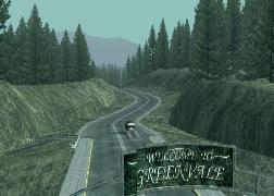
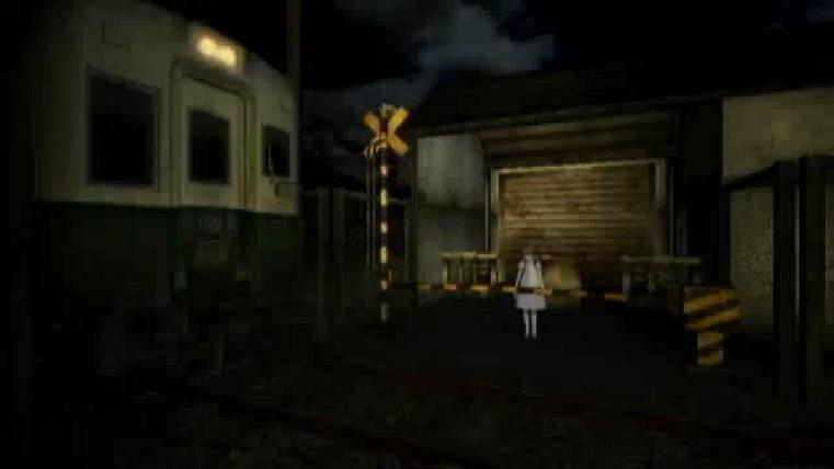
That said, the sort of unbalanced, off-kilter, uncanny feeling that Deadly Premonition promotes is indeed at least partially the result of culture shock. As I’ve written here many times before, culture shock is an asset to horror because it makes us feel like we’ve lost control. Deadly Premonition does this intentionally as well, but as with many other Japanese games, its very foreignness helps it scare us. The town of Greenvale itself is perhaps the most obvious example of this effect. The town looks like a rural American town in the Pacific Northwest; it has been painstakingly reproduced in digital form by the developers, who visited parts of Oregon and Washington to do location research during Deadly Premonition’s development. As diligently as it’s been recreated, Greenvale feels, to my American eyes (and as somebody who grew up in Oregon), a little like something out of The Twilight Zone. It reminds me of Santa Destroy from No More Heros, another game by Japanese developers that attempts to recreate an American town (though that one appears to be in Southern California). Little things here and there are wrong; for example, not only does each street in Greenvale have a name, the street names change every block. Most streets in Japan do not have names, so perhaps the designers at Access Games misunderstood how street names are used in the US. Or perhaps it was intentional. So much is intentionally odd in this game that it’s hard to tell. Whatever the rationale, the result is that Deadly Premonition can be more engaging and upsetting than it has any right to be.

THREE KEY SUCCESSES

The August 2010 issue of Game Developer magazine has a lengthy post-mortem review of Deadly Premonition, written by SWERY (the game’s director) and several other staff of Access Games. The developers select five areas in which they feel Deadly Premonition was most successful: character building, story and world building, distinctive music, casting and voiceover work, and the team’s hardcore passion for the title. I think this is an extremely honest review (the “what went wrong” section is all about the technical aspects of the game that didn’t work out very well, which I mentioned at the start), and I agree with the developer’s selections. In particular, I think that they have hit the nail on the head by naming characters, story and world, and music as the three most important elements of Deadly Premonition.

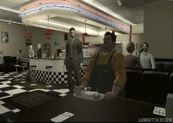
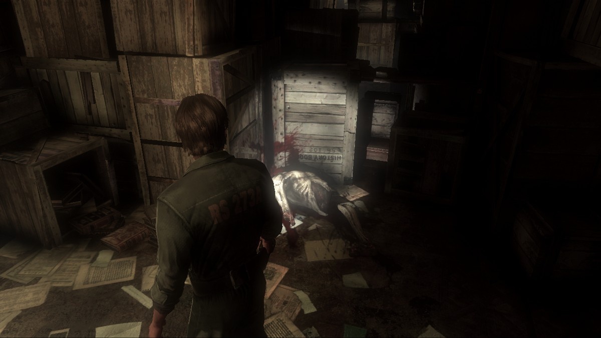
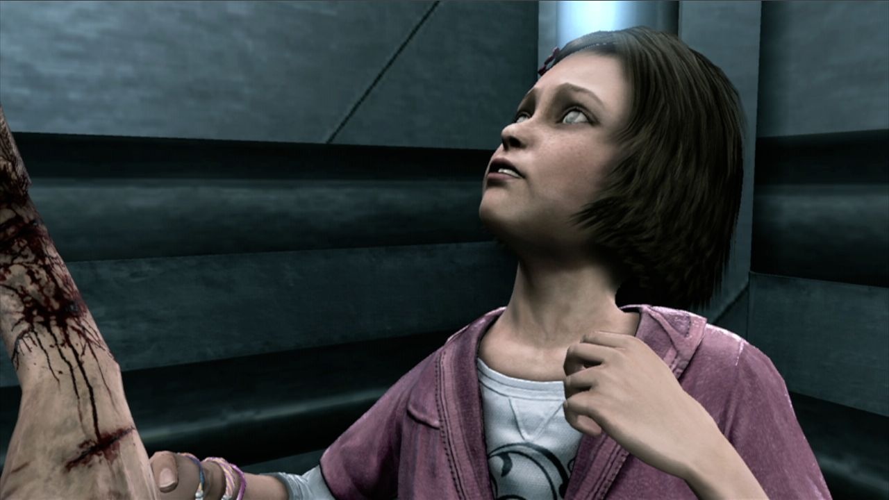
Deadly Premonition is a mystery, and it revolves around its characters. The central character, Agent York, is highly eccentric; his eccentricity makes him a fun character to play, and gives the story a reason to exist. His approach is unwaveringly serious, whether he is describing the mechanics of the relationship between Tom and Jerry (yes, the cartoon) or inspecting the teeth of a corpse. He’s constantly smoking, something we rarely see in heros today, but for York smoking is a kind of meditation.

One of the key elements of this game that propels it to such absolute quality is the way that York’s character is delivered to the player in the game. York talks to himself constantly, and these conversations serve to reveal much depth in his personality. Even better, the conversations appear to be with the player himself; York addresses you, the person holding the controller, in a way that few games have ever attempted (Metal Gear Solid 2 is the only somewhat similar title that I can think of). These moments of dialog are fantastic, but I particularly enjoyed the discussions York has with Zach (the name he uses to address the player, and eventually an important character himself) while driving. Greenvale is a large area, spread out over a five mile region, and it takes a while to drive around. While in the car, York speaks to the player about his past, his relationships with other characters, and old movies. Few games, let alone open world games, are able to work this much dialog in without stopping for cutscenes; according to the developers, York has over 3000 lines of dialog in Deadly Premonition, accounting for half of the total dialog in the game. Other games have used dialog this way before: Bioshock used reams of dialog to teach the player about key characters and the surrounding world, and Silent Hill 3’s world descriptions are all written in Heather’s voice, teaching us much about her personality. But Deadly Premonition does it better than those games. By the end of the game we feel not only great empathy for York and some of the other characters, but also that we understand his eccentric personality.

I also enjoyed the story in Deadly Premonition. Unlike another game I played recently, Deadly Premonition kept me guessing as to the real identity of the Raincoat Killer (though I did suss another, more important antagonist very early in the game). The story is interesting, and well told. It revolves around Agent York himself, and becomes intensely personal in its final act. It’s a fairly complicated tale, and one that requires a few stretches of the imagination, but it’s pretty interesting. And that’s the point.

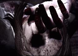
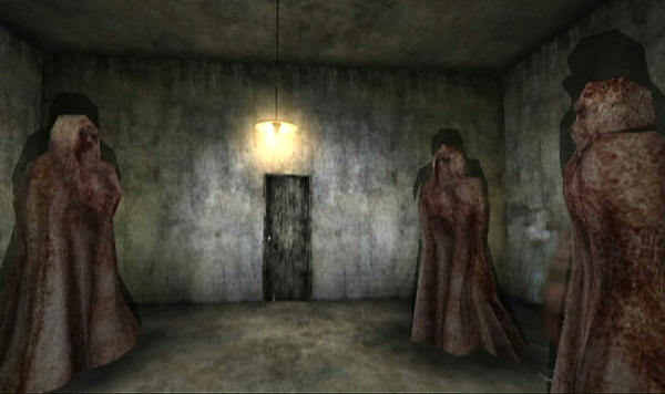
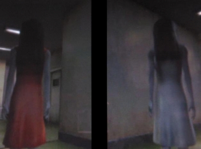
The third success named by the developers is music, and I wholeheartedly agree. The soundtrack for Deadly Premonition goes with its content very well. Remembering that this game is directly descended from Twin Peaks, there are a few tracks that are clearly designed to fill the same ominous-yet-strangely-uplifting role that is filled by that show’s main title theme. There’s a lot of acoustic guitar, piano, jazz sax, and humming in the musical landscape–not what you might expect from a horror game. My favorite track has to be the Red Tree theme, which includes a “lunatic improvisational section” to describe the madness that grips the Raincoat Killer’s subconscious. It fits right into freaky Red Rooms, angel twins, old men in wheelchairs and gas masks, and all of the other uncanny imagery that the game throws at you.

PROBLEMS, REAL AND IMAGINED

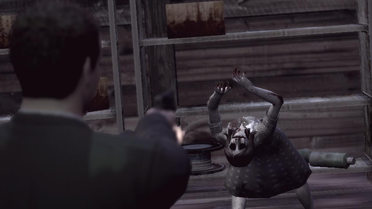
Most of the technical issues with Deadly Premonition are not true problems, just systems that seem to be too simple compared to the modern state of the art. The textures and animation, for example, are pretty low quality. The aiming system is unwieldy, and for some infuriating reason the targeting reticle vanishes once you start to fire. The collision detection is pretty strict and angular. The movement of the enemies makes for challenging gameplay until a certain weapon is acquired, after which the combat is trivially easy (with the exception of one truly annoying enemy that took me five minutes to kill each time). The camera seems jumpy because it always aligns itself with the angle of the floor. These are the sorts of technical issues that crop up in Deadly Premonition; not really bugs so much as areas lacking in the polish we’ve come to expect from modern games. There’s nothing here that really gets in the way of the game play either–no fatal flaws or deal-breaking mechanics. Just technical roughness.

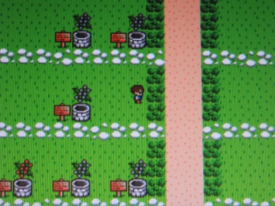
There is, however, a real problem that is worth mentioning. Deadly Premonition swings wildly between closed-off linear game play modes and open world, free form modes. Both are interesting in their own right, but the free form mode in particular has a lot of fascinating features, specifically, the way it manages time. The town of Greenvale is tied to a clock that controls when stores open, how characters move around, when the sun rises and sets, and there’s a huge amount of content here. You can sneak up to a character’s house and look in the window to see what they are up to at any given time. If they are home, they’ll be moving around, doing chores or watching TV. The town feels alive.

But the progression between these two modes is unpredictable. Most of the game is fixed and linear (though sometimes occurring within the open world), but at a few points the player finds himself with no immediate goal and is free to explore. The timing and frequency of these undirected sections is off. The first open world segment appears early in the game, before the player has had a change to grasp how the whole time-of-day system works yet. The player must be at a certain location at a certain time, and indeed, can choose to simply sleep in the hotel until that time approaches if they wish. I think most players are excited to get out and drive around.

Only, there’s not much to do at first; many of the shops open at odd times, and time in the open world mode progresses extremely slowly. Shenmue had a similar system and users complained enough that in Shenmue 2 they added a way for the player to accelerate time while they wait for a specific appointment. This first open world section seems to go on forever–I spent several hours of play driving around the city, running errands, finding items, and talking to characters. There are a few side missions that you can accomplish, but there’s no way to get anywhere close to beating all of them in this early section. Instead, the mode seems to drag on until finally, thankfully, the meeting time approaches and you can get on with the story. And as it turns out, that moment is the only time in the game where the player is given such freedom; every other open world segment is tied to a specific goal, or a short time limit. After spending so much time in the open world mode, I wasn’t excited to go back to it–I wanted to see the story progress, find the killer of the beautiful young girl. When I had a chance to do open world stuff again, I instead opted to beeline for the next obvious goal so that i could see what was going to happen next. Nothing forced me to do this, but since everything is tied to a clock, missing the next deadline would mean a whole ‘nother 24 hour cycle in the open world. That didn’t seem acceptable to me–I was hot on the trail of a serial killer and goddamn it, I’m going to catch him. There was just no time to waste.

I think that the long initial open world section, combined with the subsequent velocity of the plot, sucks a lot of the life out of Deadly Premonition’s dual mode design. I probably only experienced 1/5th of the total content available in the game (though it still took me close to 25 hours to complete) because I was more interested in advancing the story than driving around completing side missions. Perhaps that was the goal–to allow me to select the type of game play mode that I prefer–but it was still annoying.

But that’s the only real complaint I have with Deadly Premonition. The technical flaws were not a problem for me (though I do have a bone or two to pick with the aiming system and instant-failure quick timer events), and the rest of the content was so good that other minor flaws are easy to forgive. And really, when discussing the mechanical parts of the game design, Deadly Premonition gets much more right than it gets wrong.

THE OTHERWORLD

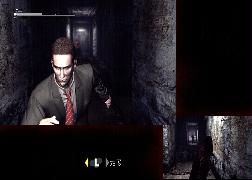
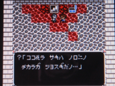
I really like how Deadly Premonition deals with the Otherworld, a label I am borrowing from the Silent Hill series to describe an alternate reality, infested with zombies and other malicious creatures, that mimics the look and layout of the real world but seems decrepit and decayed. In Silent Hill, the Otherworld is often a form of narrative beat, a way for the characters to pass into a yet-scarier version of the game, a way for the designers to ratchet the tension up another notch (or, in some cases, two or three notches, all at once). Deadly Premonition uses the same sort of game mode a different way: to separate straightforward reality from the world of hidden connections and meaning. Agent York’s descent into each Otherworld is more like a descent into the unconscious mind, where he’s able to find links between things that are not obvious in the real world. This is how York performs his investigation, by finding bits and pieces of seemingly unrelated clues and then linking them together in a way that makes the picture clear. He does this in his dreams, and sometimes the middle of a normal day. But in the Otherworld, York has the ability to physically explore this space. He calls the method “profiling.”

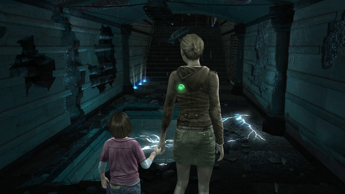
The Otherworld is not a safe place, however. Though York is able to use this nether region to draw conclusions from uncommon sources, he also makes himself vulnerable to the malicious entities that reside in that space. Perhaps, if we see the Otherworld strictly as York’s unconscious mind, we might conclude that these entities are of his own creation, based on what he knows about the case. I think it’s more likely that York is visiting a physical space, a sort of distorted mirror of the real world, where evil takes a different, more substantialform. This interpretation is reinforced late in the game, when other characters enter the Otherworld as well.

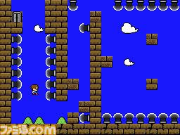
In terms of pure game mechanics, the Otherworld gives the designers a way to cleanly break between the open world and a more traditional indoor level design. This is a great place for zombies, gun combat, and exploration, which are all hard to do in an open world setting. The decision to switch not only game modes but also thematic modes when entering the Otherworld is, I think, pretty smart.

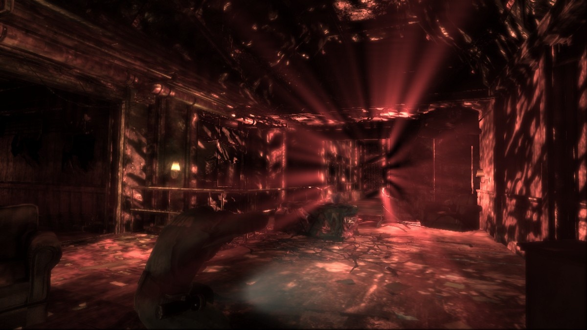
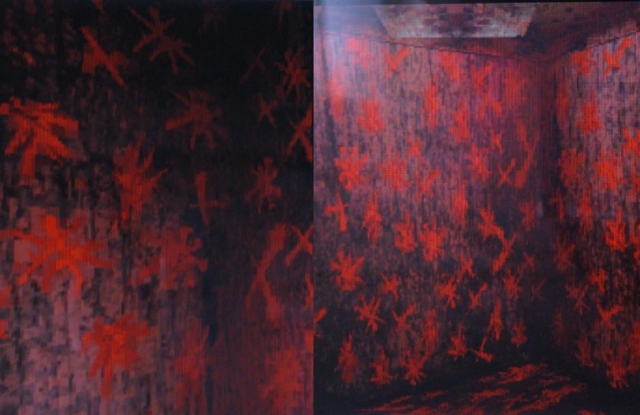
Deadly Premonition also uses the Otherworld to do something that is rare in video games: subtle foreshadowing. The game is the best example of foreshadowing that I’ve seen in quite a long time. One of the genius parts of Deadly Premonition is its use of color; the palette of the game slowly changes as Agent York gets deeper and deeper into the Otherworld, until finally the game simply smears a bright red haze over the entire frame. Silent Hill 2 used color to foreshadow, as did Condemned. But there are very, very few games that can make such a claim, and Deadly Premonition does it very well. Foreshadowing extends to level geometry as well; there’s a particular section near the end of the game in which the player must climb an incredibly long staircase (sort of the reverse of Silent Hill 2 and 4’s impossibly long staircases), all while very specific, crazy music plays in the background. The effect is pretty dramatic; the level of tension as the player reaches the door at the top of the stairs is very high.

FINISH IT UP, ZACH

This has been a long, unorganized stream of consciousness about a weird, delightful, scary game. If you couldn’t tell, there’s a lot of food for thought in Deadly Premonition, which I think is a mark of high quality. Though many reviewers may have been turned off by a lack of superficial polish, I think that Deadly Premonition is one of the best games I’ve played in a long time. It’s absolutely worth playing, thinking about, investigating, and examining. It is a rare gem.

Silent Hill: Shattered Memories

Platforms: Wii, PS2, PSP
Release Date: 2009-12-08
Regions: USA Japan Europe
Chris’s Rating: ★★★☆
This not-quite-perfect remix of the original Silent Hill is a fantastic new direction for the series.

This review was written by my good friend, Casey Richardson. Thanks Casey!

Silent Hill: Shattered Memories is the latest installment of Konami’s seminal survival horror series. The series is well known for its nightmare world tranformations and its preference for symbolism and thought provocation over explicit horror. None of the games in the series have done this more successfully than Silent Hill 2, undisputedly the pinnacle of the series, and, in my opinion, one of the best games of all time. Those are big shoes to fill and subsequent releases have had smaller and smaller feet so to speak. For Shattered Memories, Konami has opted to use an external developer, a practice in place after the dismal Silent Hill 4: The Room. They went with Climax Studios, which had previously developed Silent Hill: 0rigins for the PSP. Shattered Memories was developed specifically for the Nintendo Wii, and that’s what is being reviewed here, but let it be known (and then promptly forgotten) there are PS2 and PSP ports as well.

Shattered Memories is a reimagining of the original Silent Hill, which first appeared on the Playstation way back in 1999. It must be stressed this is most definitely not a remake. You play as the character Harry Mason, who regains consciousness from a car crash, caused by the icy roads from a snow storm and his bad driving apparently. I don’t know, maybe he could have avoided the whole mess if he’d equipped the right tires. Realizing his little daughter, Cheryl, is nowhere to be seen, Harry starts off in an epic search, which will have him wandering all over the ghost town that is Silent Hill. While the game begins in roughly the same fashion as the original, after that it’s a whole new ball game. Yes, you’re going to traverse familiar environments and run into recognizable characters, but how the story progresses is nothing like the original.

When you first boot up the game, you’re assaulted with an FBI looking warning about how the game is going to mess with you. “Psychology Warning: This videogame psychologically profiles you as you play. It gets to know who you really are then uses this information to change itself. It uses its knowledge against you, creating your own personal nightmare. This game plays you as much you play it.” This warning isn’t just hyberbole–it actually translates into real game mechanics. For example, during conversations you occassionally have contol of where Harry is looking. So, if you stare at a girl’s boobs during this time, the game is going to know you’re a pervert and will deal with you accordingly. Believe me, you are going to have plenty of opportunities like this. It’s pretty awesome. The town is littered with posters, flyers and objects which the game uses to find out what things interest you. What this all boils down to is that Shattered Memories is more about psychological horror than survival horror.

Player controls are mapped to the nunchuk, with the Z button to run (it’s more of a slow jog actually, as Harry isn’t exactly the athletic type). The flashlight, one of the staples of the series, is controlled using the Wii remote and it works as well as can be expected. The Wii remote functionality is put to absolutely great use in this game, especially with Harry’s cell phone. The B button is used to focus Harry’s attention on objects and it’s used extensively. This focus mechanic is also crucial to the game figuring out the player’s likes and dislikes.

It wouldn’t be a proper survival horror title without some door unlocking puzzles, so yeah this game’s got ’em. Your pet monkey will have no problems figuring out all but a few of them. They all involve putting the Wii remote’s capabilities to good use and they all feel well implemented, so even the simplest of puzzles are satisfying and enjoyable. It’s worth noting, due to the nature of progression in Shattered Memories, even the most complex puzzles’ solutions will always be found in the immediate area. No backtracking to found here and good riddance I say.

The music is this game is subdued but chilling. As far I can tell, the soundtrack is all new material. Akira Yamaoka once again composed the music, but unfortunately this is probably his final involvement with the series as he recently left Konami. The rest of the sounds in the game are adequet. The familiar static noise system is once again in place and used as one could expect in the chases, but it’s also used to find what are essentially journal entries as well phone numbers necessary for progression. One super nitpicky thing I noticed is the voices always sound like straight up recording booth sessions. There are a number of sequences where Harry and another character are having a discussion while walking down the street, but there isn’t any post processing done to get them sounding like they are actually outside.

Shattered Memories has some of the best replayability I’ve ever seen in a game. To really appreciate this title, you have to play through it at least twice. I would strongly suggest playing through the first time “honestly.” That’s to say when the psychologist asks you a question, give him the answer you really, truly believe. In doing so you will be surprised how well the game assesses you when that moment arrives. Then for your second playthrough, just give the opposite answers and it’ll be like playing as your evil twin. Most people are going to finish the game in just a few sittings as the game really doesn’t take more than 6 hours to beat. It has something like five different endings, and for the hardcore fans of the series you’ve probably already guessed they’ve included another crazy UFO ending.

Let’s turn our sights to the things that don’t work so well. First in my mind are the damn chase sequences. In Shattered Memories the world changing transformation causes the environment to freeze over, some faceless monsters come out and Harry is forced to run for his life. While I like the idea where the player has literally no way to fight back, and some other games have done this admirably (check out Chris’ review of Hellnight for a great example), the implementation here leaves a lot to be desired. Ultimately, they are just frustrating sequences where you run around blindly until you happen upon the exit. Supposedly you can use your GPS map function on your cell phone to track your path, but the game doesn’t pause if you use it and you can’t run while it’s up. The only options of fighting back are shaking off enemies, knocking over objects (control wise this works maybe 25% of the time) to slow the baddies down, or finding a flare to hold off the enemies for a brief period of time. Another option at your disposal are hiding places like lockers or under beds. This feature is utterly useless. The creature chasing you passes by, almost leaves the area only to immediately come back, searching. Since there’s never an opportunity for you to escape, you can only wait until the enemy has decided to find you and pulls you out of the hiding spot. This happened every single time I tried to hide, so eventually I just completely ignored the hiding spots. Despite all these shortcomings, the chases do get your blood pumping and there are a few instances where the chases are more interesting than just escaping.

There’s a real lack of variety of enemies in this game. In fact, there’s only one type and no bosses at all. They didn’t even bother to add the requisite zombie dogs. What’s a survival horror game without evil canines?

Let’s get one thing straight: this game is not scary. It’s definitely creepy and it has a really great, dark atmosphere, but if you’re looking for a game to keep you up at night this is not that game. They have plenty of jump out scares but they are actually completely telegraphed, and thus negated, due to the static noise mechanic. The static builds as you approach the scary object and when it crests something falls over or rolls around. The first time is a bit surprising, but it quickly becomes monotonous and lame. Unlike previous Silent Hills, enemies come out only during the nightmare world transformations. What this means is you know there’s nothing of harm as you travel around the town. It’s not until the world starts to freeze over that you will get that sinking feeling.

Lastly, the visuals are a bit underwhelming. We are all familiar with the graphical limitations of the Wii, but Climax should have invested more resources into the art creation. At best, Shattered Memories looks like a mediocre PS2 title. The freezing over world transformation effect is nice, but one can only wonder how much more amazing it would have looked on a more powerful machine and in HD.

In summary, Silent Hill: Shattered Memories is surprisingly successful, boldly taking the series in a new direction. There are definitely a number of issues that should be addressed in future installments, but overall the good definitely outweighs the bad. If Shattered Memories were a movie it would be considered an art-house film and not a main stream Hollywood movie. Those interested in storytelling and atmosphere are going to love it. Conversely, those interested more with action and scares are probably going to hate it. Flawed but lovingly crafted it’s a great new direction for the series.